
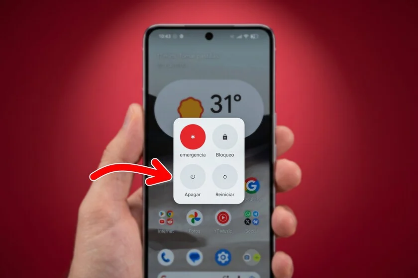

In the vast majority of devices we interact with daily, from the simplest wall socket to the most sophisticated smartphone, a common denominator exists, often overlooked yet universally understood. This is the iconography of their power buttons, dominated by a straight vertical line ("|") and a hollow circle ("O"). While ubiquitous today, its adoption masks a complex journey driven by industrial necessity, a tale of globalization, standardization, and ingenious design that transcends linguistic and cultural barriers to ensure seamless interaction with technology across the globe. This seemingly minor design detail represents a monumental achievement in universal communication, silently guiding billions through the intricacies of modern electrical and electronic equipment.
The Pre-Standardization Era: A Tower of Babel in Electronics
Before the emergence of these universal symbols, the landscape of consumer electronics was a linguistic labyrinth. In the nascent years of electronic expansion, particularly throughout the mid-20th century, machines and appliances relied heavily on textual labels to denote their fundamental functions. Switches and buttons invariably featured the words "On" and "Off," often accompanied by arrows or simple indicators. While perfectly functional within a single linguistic context, this approach quickly became unsustainable as the electronics industry began its rapid ascent towards globalization. Manufacturers in one country would produce goods for markets spanning multiple continents, each with its own dominant languages.
The challenges were twofold and increasingly pressing. Firstly, the reliance on English terms like "On" and "Off" rendered devices unintelligible or, at best, confusing for a significant portion of the global population unfamiliar with the language of Shakespeare. This linguistic barrier not only frustrated users but also posed significant safety risks, as incorrect operation due to misinterpretation could lead to malfunctions or even accidents. Imagine purchasing an appliance where the basic function of activation or deactivation was a mystery, requiring constant reference to a translated manual, if one was even provided or accurate. This scenario was a genuine impediment to market penetration and user adoption in diverse regions.
Secondly, the relentless drive towards miniaturization in electronic components and devices meant that the available space for printing instructions was shrinking dramatically. As radios became portable, televisions sleeker, and early personal computers began to emerge, designers found themselves grappling with the dilemma of conveying complex information in ever-smaller footprints. Lengthy textual labels became impractical, cluttered the aesthetic, and added unnecessary manufacturing costs for multi-language variants. The industry was at a crossroads, needing a solution that was concise, universally understood, and adaptable to shrinking form factors. The imperative was clear: create an international standard that bypassed language entirely, a visual Esperanto for machines.
The Dawn of Universality: IEC and ISO Intervene (1973)
The solution to this linguistic and spatial friction arrived in 1973, spearheaded by the International Electrotechnical Commission (IEC). Established in 1906, the IEC is a non-profit, non-governmental international standards organization that prepares and publishes international standards for all electrical, electronic, and related technologies. Its mission is to promote international cooperation on all questions of standardization in the electrical and electronic fields. Recognizing the urgent need for a common visual language, the IEC introduced a comprehensive collection of graphic symbols for use on equipment. This monumental effort was subsequently codified under the joint umbrella of the ISO 7000 / IEC 60417 document, "Graphical symbols for use on equipment."
The primary purpose of this meticulously curated catalog was to establish a set of mandatory symbols for use on equipment, thereby ensuring that any operator or user, regardless of their native language or technical background, could correctly and safely utilize devices. This initiative was not merely about convenience; it was a critical step towards enhancing product safety, facilitating international trade, and reducing manufacturing complexities. The standardization process involved extensive research, testing, and consensus-building among experts from numerous countries, reflecting a global commitment to interoperability and user-centric design. The IEC’s collaboration with the International Organization for Standardization (ISO), a worldwide federation of national standards bodies, further solidified the global acceptance and implementation of these symbols. ISO’s broader mandate to develop voluntary international standards that support innovation and provide solutions to global challenges made it the ideal partner to ensure the widespread adoption of these electrical symbols beyond just the electrotechnical sphere.
Within this framework of standardization, the two fundamental elements for power control – "on" and "off" – were precisely defined. These definitions were not arbitrary but were conceptually rooted in the fundamental operation of electrical circuits. The vertical line was designated to represent the "on" state, signifying a closed circuit where current flows. Conversely, the hollow circle was chosen to represent the "off" state, indicative of an open circuit where the flow of electricity is interrupted. This logical basis, grounded in the very physics of electrical engineering, provided a robust and intuitive foundation for their universal interpretation. The simplicity and clarity of these symbols were paramount to their success, allowing for immediate recognition and understanding by a global audience, thereby effectively dismantling the linguistic barriers that had previously plagued the electronics industry.
Deconstructing the Symbols: Beyond the Binary Myth
For many years, a popular belief has circulated that these power symbols are simply the binary digits "1" and "0" – where "1" represents a logical "true" or "on" state, and "0" signifies "false" or "off." This analogy is undeniably compelling; it neatly aligns with the on/off functionality of devices and resonates with the digital age’s pervasive understanding of binary code as the fundamental language of computers. It offers an intuitive, albeit incorrect, mnemonic that has undoubtedly aided in the symbols’ widespread adoption and understanding. However, while the binary analogy is a convenient mental shortcut, the actual genesis of these symbols predates the popularization of binary code in everyday user interfaces and is instead rooted in the physical state of electrical conductors and the design principles of control mechanisms.
The core concept behind the vertical line and the circle stems directly from the state of an electrical circuit. The vertical line ("|") represents a closed circuit, meaning the electrical path is complete, allowing current to flow, thus activating the device – the "on" state. Conversely, the hollow circle ("O") symbolizes an open circuit, where the electrical path is broken, preventing current flow, thus deactivating the device – the "off" state. This direct mapping to the physical reality of electricity makes the symbols inherently logical from an engineering perspective. It’s a pragmatic representation of the interruption or completion of power, designed for clarity and universality rather than a direct translation of a numerical system.
Adding another layer to this fascinating etymology is a highly debated theory that traces the design of these symbols back even further, to the Victorian era. This hypothesis posits a connection to the ancient disc valves used for pipes, particularly in gas or water systems. According to this narrative, when a valve was closed, obstructing the passage of gas or liquid, an operator would visualize the full, round face of the gate or disc – hence the circle. However, when the valve was opened by turning a key or handle 90 degrees, the metal disc would present itself in profile to the human eye, appearing as a thin, straight line. While this theory lacks definitive historical documentation and is largely speculative, it offers an intriguing perspective on how intuitive visual metaphors for "open" and "closed" states might have evolved over centuries, predating electricity but providing a conceptual framework for its representation. Regardless of its historical accuracy, it underscores the human tendency to distill complex states into simple, universally recognizable visual cues.
From Toggle Switches to Single-Button Power: An Evolution in Design
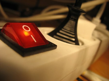
In their earliest applications following standardization, devices typically featured physically separate icons for "on" and "off" on their chassis. Toggle switches, which remain prevalent in many applications such as power supplies for personal computers, power strips, and various industrial machinery, explicitly display the vertical line at one end of the switch’s travel and the circle at the opposite. This clear physical separation unequivocally indicates whether the current flow is open or closed, providing immediate visual feedback to the user. A flick of the switch moves the mechanism to align with either the "on" (line) or "off" (circle) symbol, leaving no room for ambiguity.
However, as consumer technology advanced rapidly through the late 20th century, the design paradigm shifted. The bulky, often loud, toggle switches gave way to more ergonomic and aesthetically pleasing push-buttons. These single-action buttons were designed to serve both the "on" and "off" functions with a single press, often coupled with a "standby" mode – a low-power state where the device is not fully off but ready to quickly resume operation. To visually communicate that a single button commanded both activation and deactivation, or a transition to standby, designers were compelled to merge the "|" and "O" symbols. This fusion gave birth to the combined icon, typically a circle with a vertical line partially or fully intersecting it, which is the variant most commonly seen today.
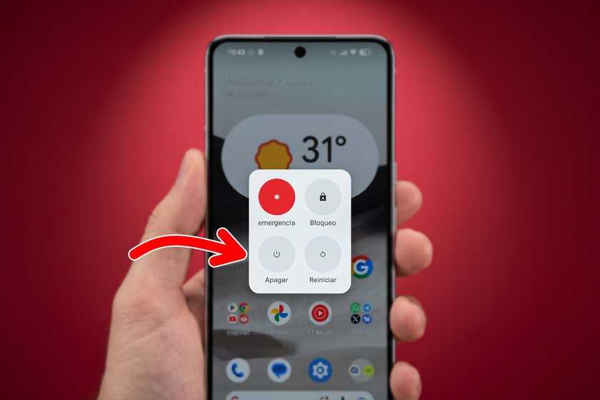
It is here that a subtle but significant divergence from the strict IEC definition emerged. According to the IEC 60417 standard, the combined symbol (a line interrupting a circle) specifically denotes a "standby" function – a state where the device is powered but in a low-power, inactive mode, ready for immediate full activation. However, in practice, and particularly with the proliferation of modern consumer electronics like smartphones, tablets, and televisions, this combined symbol has been widely adopted by manufacturers to simply represent the general power on/off function. Whether pressing it fully powers down the device, puts it into standby, or simply toggles between an active and inactive state, the symbol has become the de facto universal indicator for interacting with a device’s power state. This pragmatic adoption, while technically a slight deviation from the standard’s original intent for "standby," highlights the symbol’s incredible adaptability and the intuitive grasp users have developed for its meaning: "press here to change the power state."
The Profound Impact of a Simple Icon
The standardization and subsequent evolution of the power symbol represent far more than a mere design choice; they signify a profound triumph of universal design and international cooperation with far-reaching implications across multiple domains.
Enhancing User Experience and Accessibility: At its core, the power symbol is a testament to user-centric design. By eliminating language barriers, it has made electronic devices intuitively accessible to billions of people, regardless of their literacy level, linguistic background, or cultural context. This universality dramatically lowers the cognitive load for users, allowing for immediate and confident interaction with technology. In an increasingly interconnected world, where devices are manufactured in one country and sold in hundreds of others, this shared visual language is indispensable for a seamless user experience. It empowers individuals, fostering greater independence and reducing frustration when interacting with new or unfamiliar equipment.

Facilitating Global Trade and Safety: From an industrial and economic perspective, the power symbol has been a silent facilitator of global trade. Manufacturers no longer need to produce multiple versions of devices with different textual labels for each target market, significantly reducing production costs, complexity, and inventory management. This standardization streamline design, testing, and regulatory approval processes, accelerating market entry for new products. More importantly, clarity in power control is a critical safety feature. Misunderstanding how to turn a device on or off can lead to improper use, electrical hazards, or damage to equipment. The unambiguous nature of the IEC-standardized symbols contributes directly to safer product usage worldwide, safeguarding both consumers and property. Regulatory bodies globally rely on these standards to certify products, reinforcing a baseline of safety and usability.
A Pillar of Design Philosophy: The elegance of the power symbol lies in its minimalist simplicity. It conveys a complex concept – the flow of electricity, the state of a machine – with just two geometric primitives. This embodies a powerful design philosophy: that effective communication can be achieved through brevity and universality. It stands as a prime example of how thoughtful, standardized iconography can transcend the need for verbose instructions, allowing technology to blend more seamlessly into our lives. Its enduring relevance, despite fifty years of technological upheaval, speaks volumes about the foresight of its creators and the timeless appeal of its design.
The Enduring Legacy: A Testament to Universal Design
In conclusion, while today it may seem unnecessary to delve into the history behind the simple act of powering on a mobile phone or a television, understanding the logic and journey of these ubiquitous symbols reveals a compelling narrative of innovation and global cooperation. What began as an ingenious engineering solution to represent the fundamental states of electrical circuits has evolved and consolidated into an infallible language that transcends geographical borders and technological formats. The vertical line and hollow circle are more than just icons; they are a universal shorthand, a silent dialogue between humans and machines that has stood the test of time.
Fifty years after their standardization by the IEC, these symbols remain profoundly relevant, serving as a testament to the power of thoughtful, universal design. They exemplify how seemingly small, overlooked details can have a monumental impact on daily life, facilitating communication, enhancing safety, and underpinning the vast global ecosystem of modern electronics. In a world increasingly fragmented by diverse languages and cultures, the power symbol stands as a beacon of unity, a silent, powerful reminder of humanity’s capacity to create shared understanding through elegant simplicity.
